SOS Lost Pets NW Prototype Website Redesign
UX/UI | Case Study/Redesign | March-April 2025 | Prototype
What is SOS Lost Pets NW?

SOS Lost Pet Rescue NW is a non-profit that rescues abandoned and surrendered cats, and provides medical care, spay/neuter, vaccinations, and microchipping before placing them in loving, screened homes. They offer free emergency pet rescue, community support and advice, and limited TNR (trap, neuter, return) to help reduce the stray cat population of the local Multnomah county area.

The Problem
Visitors of the site ran into many issues with navigation of the current site as it currently stands, with problems like confusing and broken donation forms, lack of key and valuable information, and serious lack of adoption options throughout the site. Overall, we saw the site as a lack of trust for the non-profit and in general will turn users away with it’s current first impression.
What Our Goal is to Help
Myself and a team of two other teammates set out to update the site for the better. We wanted to create a viewing experience that is easier to understand, better to navigate from page to page, and an overall more informational experience that can drive up funding and support for the non-profit going forwards.
My Contributions
User Research and Interviews: I helped to create Interview questions based off of the website as it currently stands and how it can be improved upon to help more clearly display the information needed.
Wireframing and Components: I created many components and design aspects on the wireframes that eventually became our final out put. Most specifically I helped to create various image carousels, product cards and general design of the whole.
Usability Testing Plan: I created a testing plan at the end of the wireframing process and conducted Usability test interviews to make sure that the final outcome was pleasing and working correctly.
Meet Ruth Beck

Our team, through user interviews and research developed this persona to guide our user centered problem and keep us aligned with our end goals.
Throughout our time during the project we ideated how we could truly get into the mind of our User, the steps that she might take to contribute to the organization. We started with aspects like the user journey; explaining how distrust and hidden information may lead to a negative result and frustration.
The Process


From there we decided what we wanted an updated sitemap to focus on, where we wanted clearly lay out how to turn a page from the current website and what we can do to make the site more seamless and appealing. These aspects reflected our user’s needs for betterment from the original site.
With both of these steps developed we moved into Low and Mid-Fidelity wireframing and prototyping and testing based off of these results. This set the foundation for what our updated site was to look like going forwards.

Reaching the Final Result
With everything established through prototyping and testing a component library was made and a brand identity which reflected the user’s values was developed, showcasing a newer and refreshing look for the brand while keeping some of the same colors and themes.

Concluding Result
I, along with my team, created a product that product that was fully improved on. Not only the look and aesthetics of the website but we improved clearer information on every single page, a clearer user path and journey, and features that the feel closer to what the non-profit’s message can be.
Moving forward, our next step would be to reach out to the stakeholders and show how our updates can benefit their goal and spreading their message. We would use this to pivot to helping the site reach it’s full potential by creating a more welcoming interface, while cleaning up the mess of confusion from the first iteration.
Current Site:

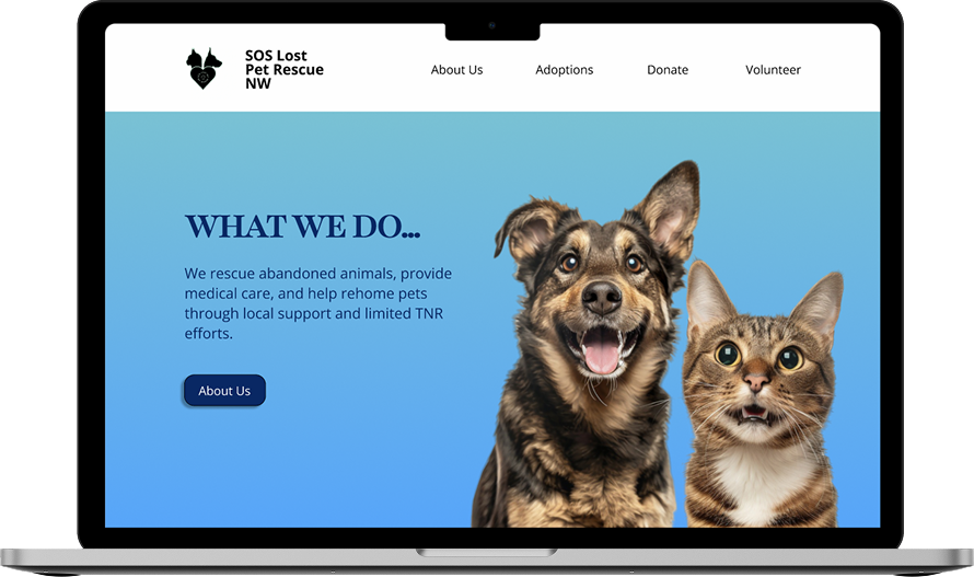
Our Updated Site: